U of T epidemiology students release playbook for their popular COVID-19 dashboard

Isha Berry, a PhD student at the Dalla Lana School of Public Health, is the co-creator of the COVID-19 in Canada open data dashboard (photo courtesy of CIHR)
Published: August 18, 2021
A popular student-led pandemic dashboard just published its playbook allowing anyone to use its data on COVID-19 trends in Canada.
“We have some graphs and maps showing how the data can be used,” says Isha Berry, one of the dashboard's creators and a PhD student in epidemiology at the University of Toronto's Dalla Lana School of Public Health. “It’s very illustrative, but it allows people to get an idea of what you can do.”
The methods paper, published in the journal, Scientific Data, describes the data descriptors that were used to inform the daily reports for the dashboard, COVID-19 in Canada.
“The data descriptor is just an overview of our whole methodology process. We have a technical report that we have written up, but we knew that it’s not super easy to always find a technical report or to know what to look for,” Berry says.
The paper shows how the students worked with COVID-19 data that’s reported in different ways across jurisdictions. British Columbia, for example, doesn't report cases on weekends. Some provinces break down COVID-19 cases by age group, while other provinces don't.
Berry is seeking more information on travel-related cases since borders are reopening and they were initially the source of virus transmission. “As we start opening it will be really useful to continue to gather that data because I think [border transmission] will be a bigger source at some point if we are able to contain our domestic transmission,” Berry says.
Dashboard co-lead and PhD student at Dalla Lana Jean-Paul Soucy wants a breakdown of case severity by vaccination status.
“I hope we see more regional data on hospitalizations and data on severe outcomes by vaccination status. The latter will help bolster the case for vaccination," he said. "Hospitalizations due to COVID are in the spotlight in the United States right now, and the Department of Health and Human Services provides information on how local hospitals are affected by the pandemic to a level we can only dream of in Canada.”
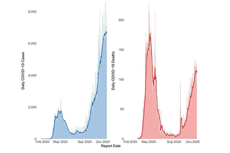
COVID-19 case and mortality epidemic curves in Canada. Daily reported (a) cases and (b) mortality with seven-day moving averages (bold line), across Canada since the first announced case on Jan. 25, 2020 up to Dec. 21, 2020.
Berry has learned that observing a weekly case average, as opposed to daily case counts, provides better insights into trends. It helps her team see how things will unfold before they happen. But, like any open-access software, users have free rein over how they interpret the data. Transparency is key.
“It really allows people to conduct analysis in real-time, especially when this is open data that’s published every day,” she says. “We really rely on lots of these open, publicly available data sets to forecast, understand and anticipate what policies might need to be implemented.”
PhD Program Director Laura Rosella, an associate professor at Dalla Lana, agrees that open-access data is important for transparency and reproducibility.
“Of course, not everyone will have the ability to use the data but knowing it’s there and that people with different skills and abilities can work on it helps build trust and can enhance the insights by opening data analysis up to a broader range of skillsets,” Rosella said.
Rosella said she is proud of the students who got the dashboard project off the ground a year-and-a-half ago. “One reason I think they were able to push this so far is the willingness of this generation of students to see difficult problems as a team sport and one where putting different skills together can achieve something really powerful.”
Initially, Berry and Soucy were the only two students working on the dashboard. The team grew to 16 U of T and University of Guelph students, and by June of this year, the team had automated some processes to make data curation easier.
“When we started, there was no one else really doing it. It didn’t really exist for Canada, and now there are so many different data sources that have been so open,” Berry says. “I don’t know to what extent we’ve been helping that, but I think something that’s really been cool is to see that.”
This work was supported by U of T’s COVID-19 Student Engagement Award.


