Engineering students dig through snowplow data to gauge Toronto’s response to winter storms
Published: May 10, 2022
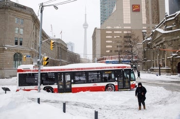
Last January, as 55 centimetres of snow blanketed Toronto over a period of just 15 hours, the city’s snow-clearing fleet appeared to struggle to keep up. But was it actually different than other storms, or did it just seem that way?
For three students in the University of Toronto’s Faculty of Applied Science & Engineering who were taking “Data Science for Engineers,” a graduate-level course taught by Sebastian Goodfellow, an assistant professor in the department of civil and mineral engineering, it was the perfect case study to test out their new number-crunching skills.
“There was a lot of news coverage at the time saying the city had poorly responded,” says Katia Ossetchkina, a master’s candidate. “We wanted to see if there was a way to analyze the movement and dispatch of snowplows and salt trucks across the city.”
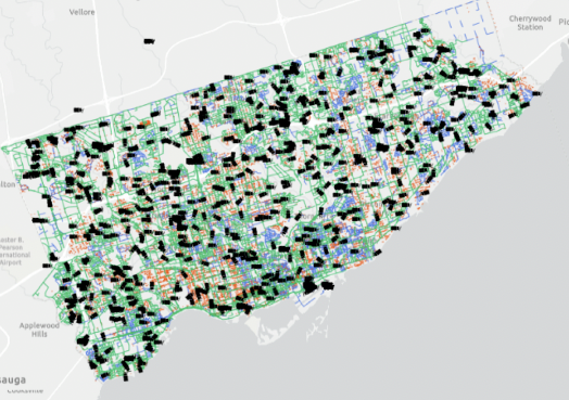
Real-time data on the locations of Toronto’s more than 800 snowplows and salt trucks is publicly available during the winter months. There is even a website that tracks this data on a map. But the team – which also included master’s candidates Thomas de Boer and Lucas Herzog – soon realized they needed more.
“There’s no historic storage,” says de Boer. “You can’t just download it as a file, so we had to create an algorithm that would ping that web server and download the data and store it on our computer, which we could then use to build up our own historic database and do our analysis off that.”
By the time the team had its technique up and running, it was too late to gather data from the January storm. But by analyzing data from subsequent storms –and gleaning stats about the earlier ones from the city and local news articles – the researchers were able to verify that the city’s response improved as the winter went on.
“We learned that Toronto had increased the number of plows on the road in February, compared to January, and the crews were quicker to reach certain benchmarks, such as the percentage of roads that had been plowed by a certain point during the storm,” says de Boer.
Herzog says that the team picked up other interesting trends as well.
“Of course, they plow the arterial roads first, but we saw that they would stop plowing around 6 a.m. – just before the morning commute,” says Herzog.
“And that’s where a lot of these Twitter complaints stemmed from,” adds de Boer. “People were wondering how they are supposed to get to an arterial road when the street outside their driveway is blocked by two feet of snow.”
Spurred on by these sorts of observations, the team decided to take the project a step further by applying their data analysis to Twitter messages. The team used Twitter’s application programming interface (API) to gather the comments of those tweeting to Toronto 311 and the City of Toronto Winter Operations account. They were then able to perform what is known as “sentiment analysis,” measuring whether the words used in the tweets were positive or negative.
That allowed the team to compare the public response from the January storm to another one that occurred in February.
“We saw lots of negative tweets in January with people complaining about not being serviced yet, and that came with a lot of geographical information as well, so we could see the hardest hit areas,” says Ossetchkina.
“Then we saw this reversing trend in February where people were saying, ‘Thank you,’ and saying that the city was doing a good job in specific regions. It was a very interesting performance metric.”
The team says that this type of data analysis could help other engineers on future projects. They have made their historical database publicly available, and have even crafted detailed instructions so that other teams can replicate their approach.
Goodfellow says he was very impressed with the students’ work.
“What I like about this project is that it’s entirely unique,” he says. “This is a new dataset that the students have made publicly available, and that can now be used by other engineers to investigate new questions or to hone their data science skills.
“Even better than that, it’s a dataset from the city we all live in, which provided a special motivation for the students to truly go above and beyond.”

